THE SHOP REDESIGN
Revamping The Shop: Building an User-Friendly Interface
ROLE
UI/UX Designer
DURATION
8 Weeks
TEAM
Team Project
TOOLS
Figma
Project Overview
Revamping The Shop’s Website to Elevate User Experience
The Shop is a small boutique located at La Jolla Cove, specializing in arts and apparel, aiming to expand into the furniture industry. The goal of this project was to improve The Shop's online presence by redesigning its interface to create a more user-friendly and visually appealing experience. The redesign focused on streamlining the shopping journey, enhancing navigation, and boosting user engagement and satisfaction.
Problem
The Shop’s website was struggling to convert visitors into customers, with most users opting not to make purchases online. Base on our user interviews, we discovered several key pain points related to both functionality and aesthetics.
Low Online Engagement and Conversion
Many frequent customers admitted they had never made a purchase through the website.
"I've never actually bought anything through the website…" — Frequent customer
Unappealing Visual Design:
Users criticized the clashing green color scheme, hard-to-read fonts, and distracting background images.
"I don’t like the color choices and font they use buse…background images are distracting." — Potential customer
Disorganized Navigation and Poor Usability:
Customers found it difficult to understand what the store offered due to the cluttered homepage and unorganized navigation.
"The website doesn't feel welcoming… I can’t tell what they offer from the homepage." — Potential customer
Goal
Expanding Offerings and Enhancing the Website
After meeting with the owner of The Shop, Nate, we gained insight into his vision of expanding into furniture sales and offering customizable options to customers. To align with this goal, we will integrate new furniture sections into the website while ensuring a smooth and engaging shopping experience that highlights these new offerings.
Design a visually appealing website that attracts new customers and effectively displays a diverse product range.
Integrate new sections for furniture, allowing for custom orders, and add informative 'About Us' and 'Contact Us' pages.
Improve site infrastructure to simplify user flows and make navigation more user-friendly
Competitive Analysis
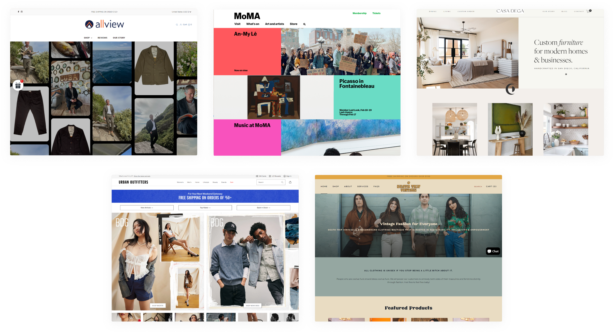
We researched competitors in various sectors to find inspiration and learn from their approaches. Key takeaways include:
Effective use of images, colors, and fonts on the homepage to capture customers' attention.
Organizing navigation bars to accommodate a diverse product range.
Maintaining a consistent style across all pages for cohesive branding.
Moodboard
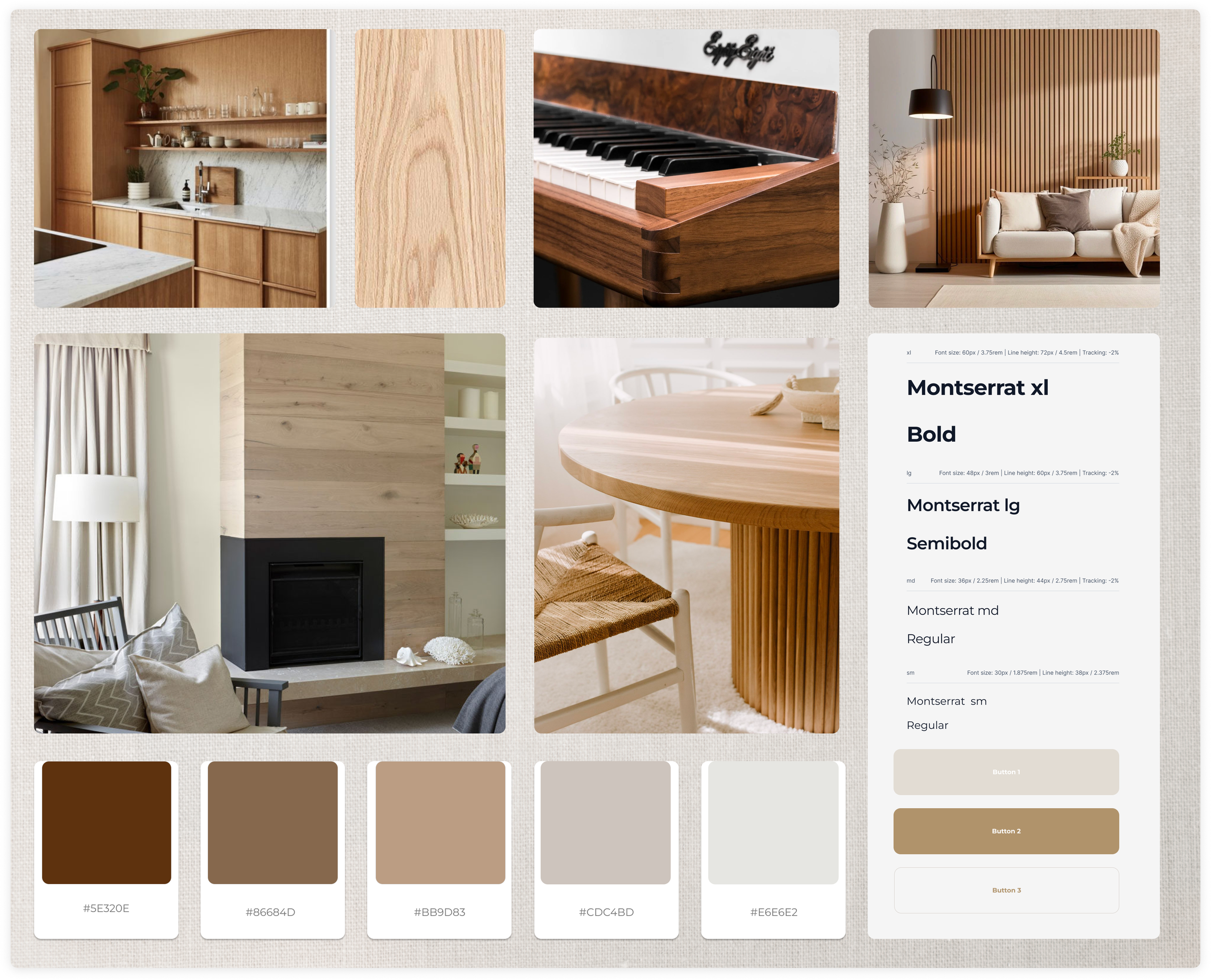
Simplicity, Warmth, Modernity
Our mood board blends simplicity, warmth, and modernity, featuring earthy tones such as warm browns and soft beiges. These colors evoke the natural beauty of wood, reflecting the store's interior. The client expressed positive feedback on the color palette and layout, reflecting their satisfaction with the aesthetic and structure.
Information Architecture
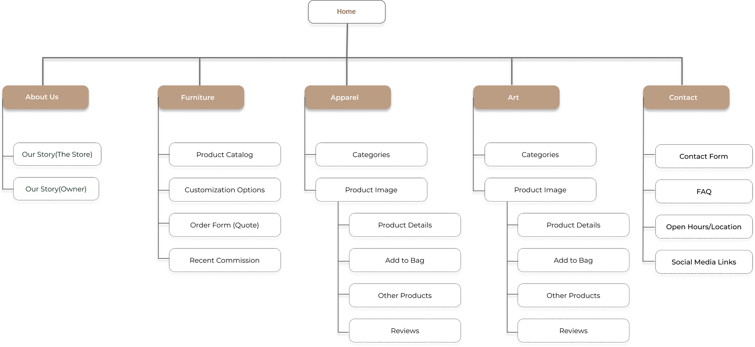
This site architecture defines the website's structure. Due to the diverse product range, it was important for me to organize the key components and functionalities effectively. The site is divided into six pages: the homepage, About Us, Furniture, Apparel, Art, and Contact Us.
Wireframes
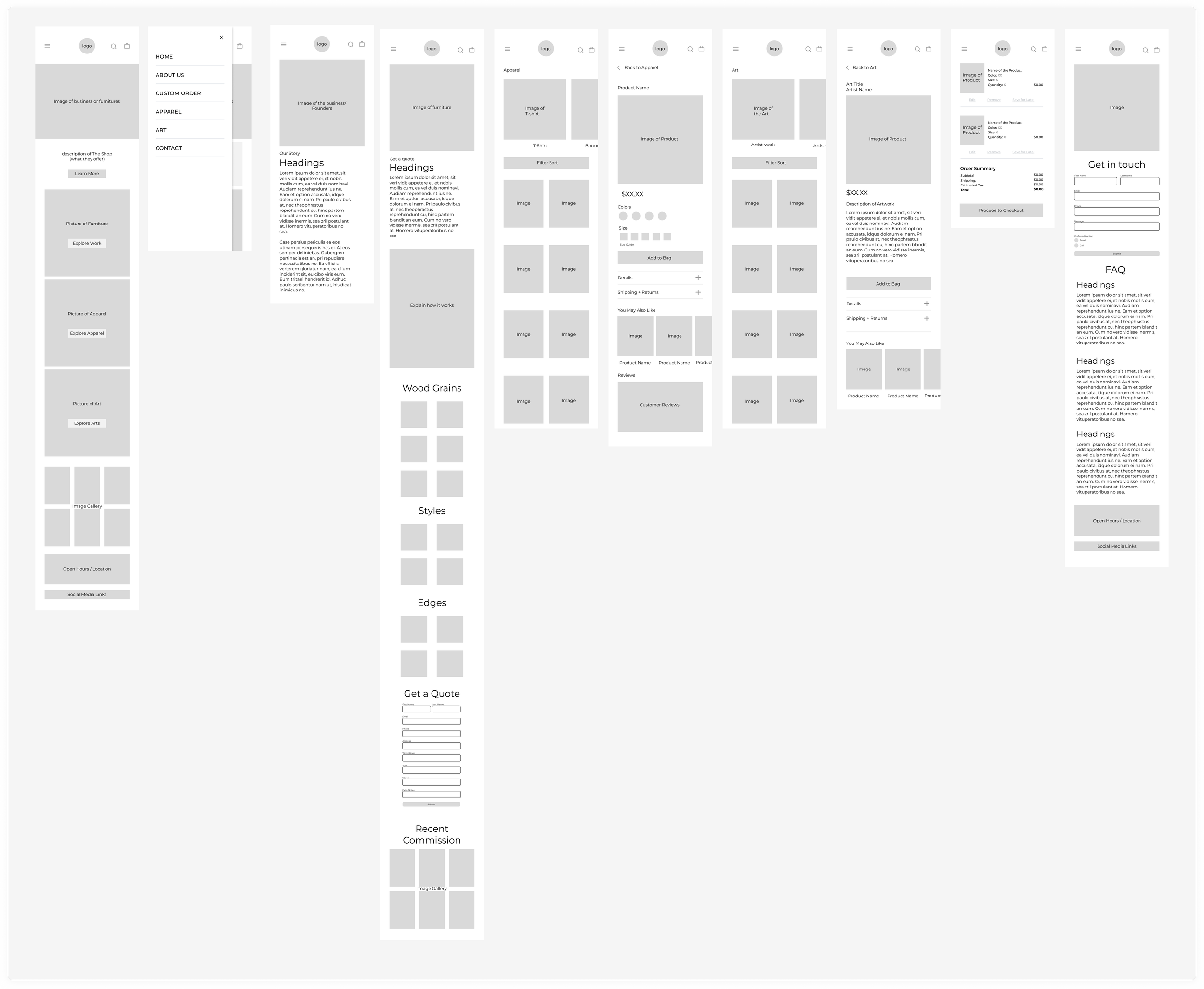
We focused on mobile design when creating the wireframes, opting for large images to clearly visualize the categories for furniture, apparel, and art. We engaged with our client to confirm their satisfaction with the proposed context and layout, actively seeking their approval and feedback.
Prototype
Low-Fidelity Prototyping
The low-fi prototype allowed us to rapidly visualize and iterate on ideas. It ensured that the fundamental structure aligned with our client’s requirements and vision.
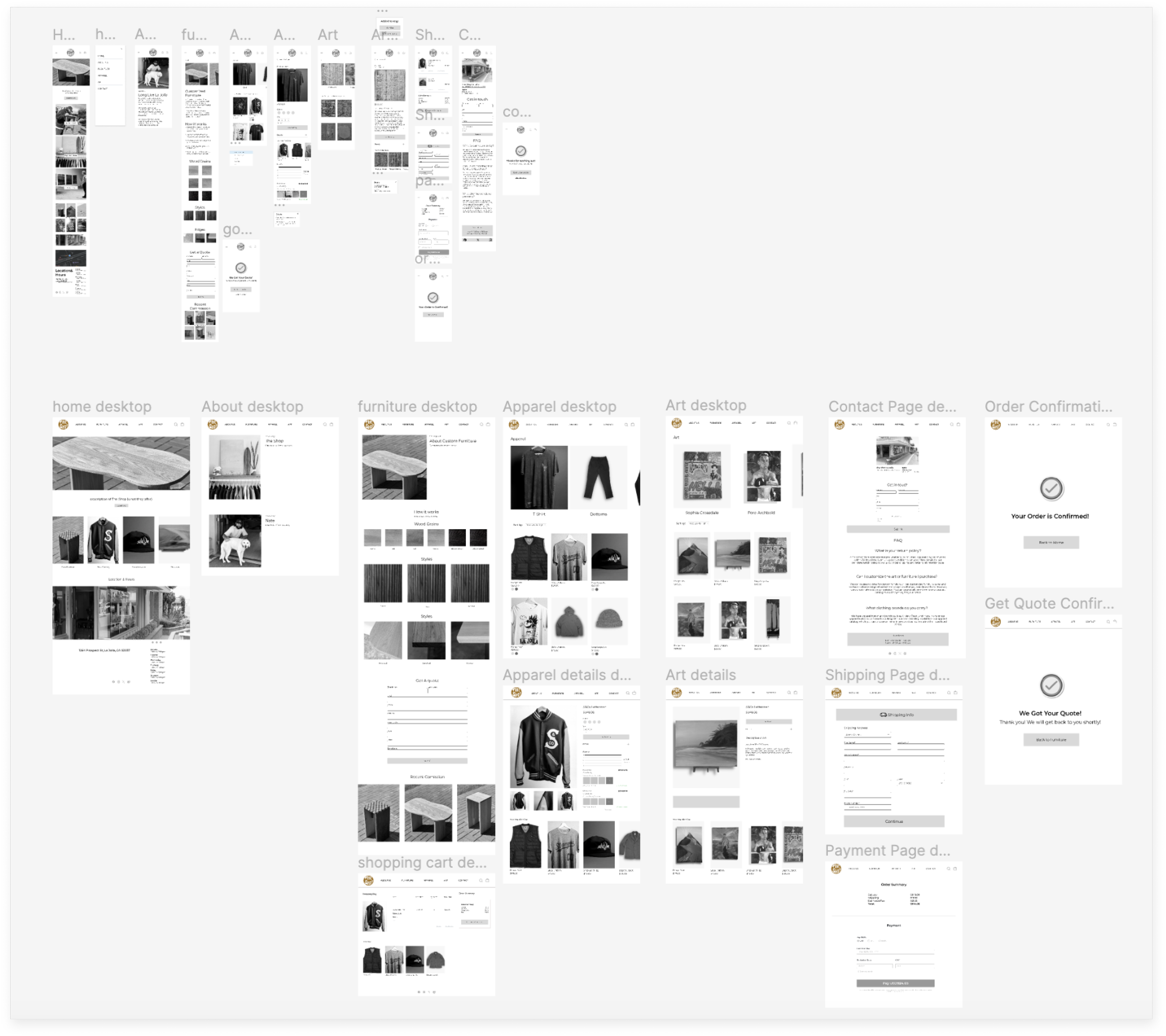
Mid-Fidelity Prototyping
The mid-fi prototypes incorporate specific visual elements like fonts and colors, offering a more accurate preview of the final design. This stage is crucial for assessing both the aesthetic appeal and functional capabilities of the product. It facilitates effective feedback collection and supports comprehensive usability testing.
User Testing
We partnered with another group to conduct a critique session and multiple user tests, leading to several modifications to our mid-fidelity prototypes.
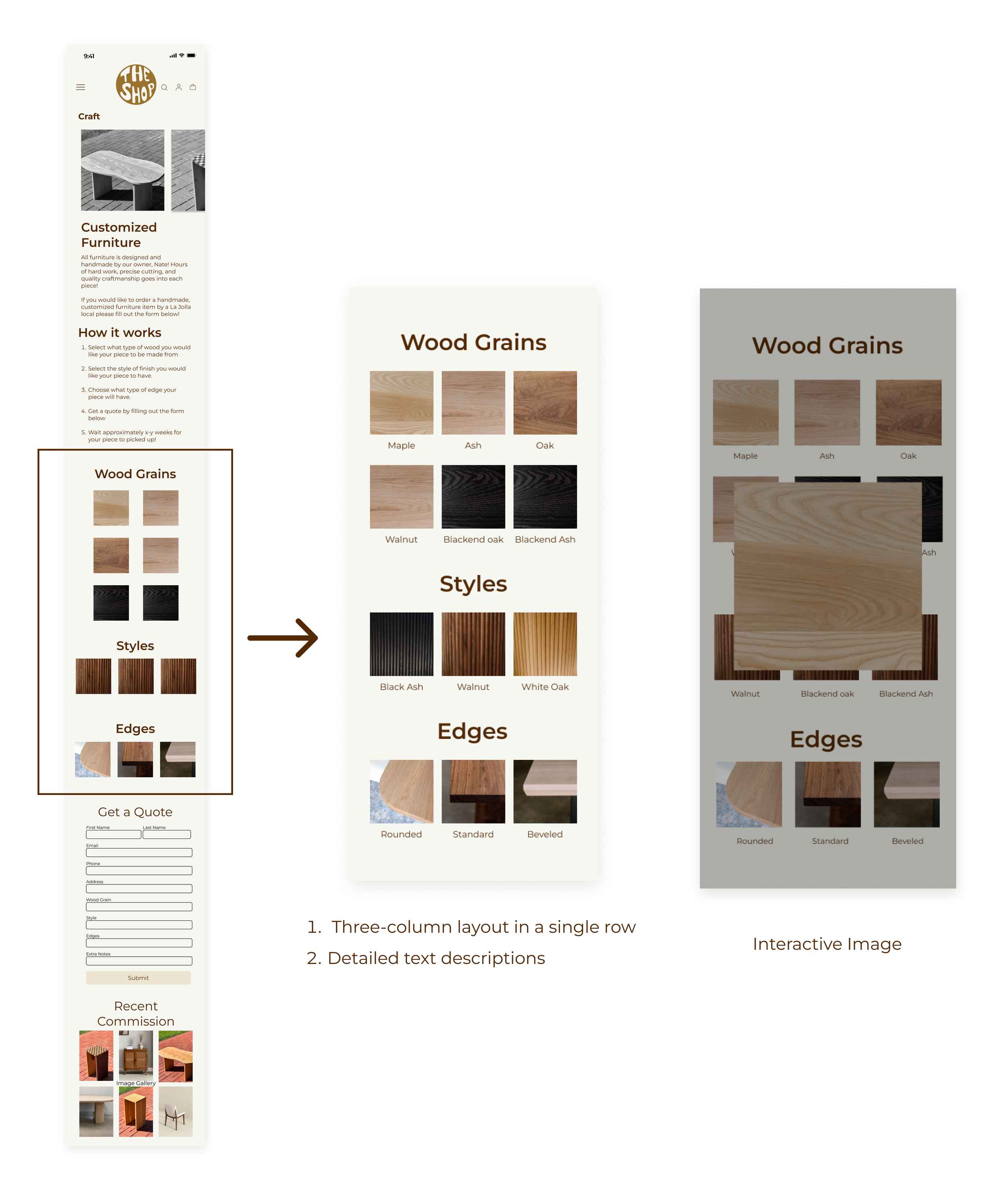
Custom Furniture Page
The first improvement involved:
Adding text descriptions for customization options
Revise the column layout to ensure consistency
Making the images interactive, allowing users to view detailed images upon clicking.
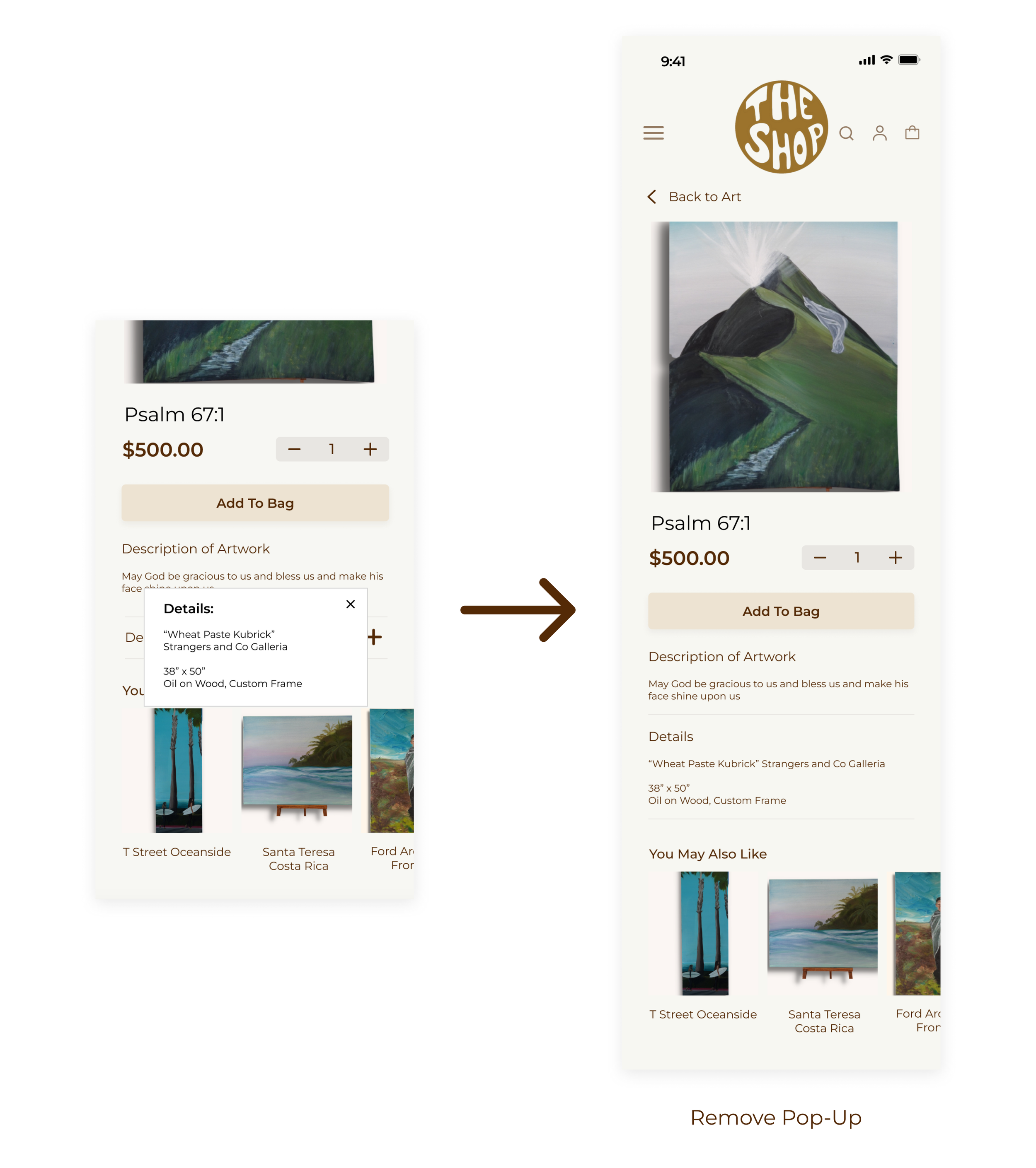
Product Detail Pop-up
We initially presented product details in a popup format, but based on user feedback, they stated that it is unnecessary, we opted to eliminate the popup and directly display the details instead.
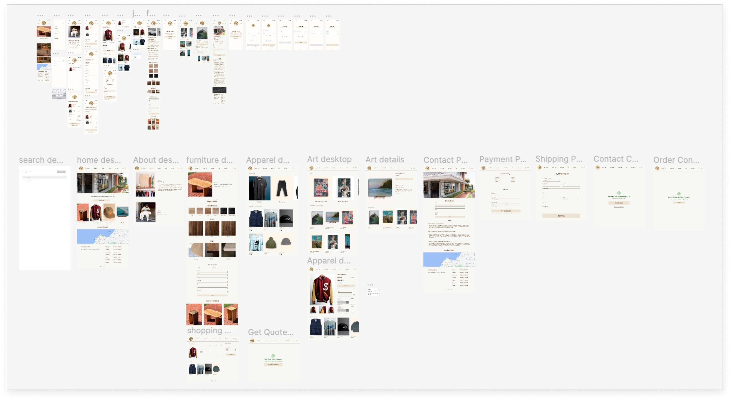
Final Design
Homepage
Before finalizing our prototype, we developed a click-through version to conduct usability tests and understand how users interact with the new website. We conducted three user tests, observing participants as they completed tasks. We received both positive and constructive feedback, which we then incorporated into the final design.
Updated Homepage Design
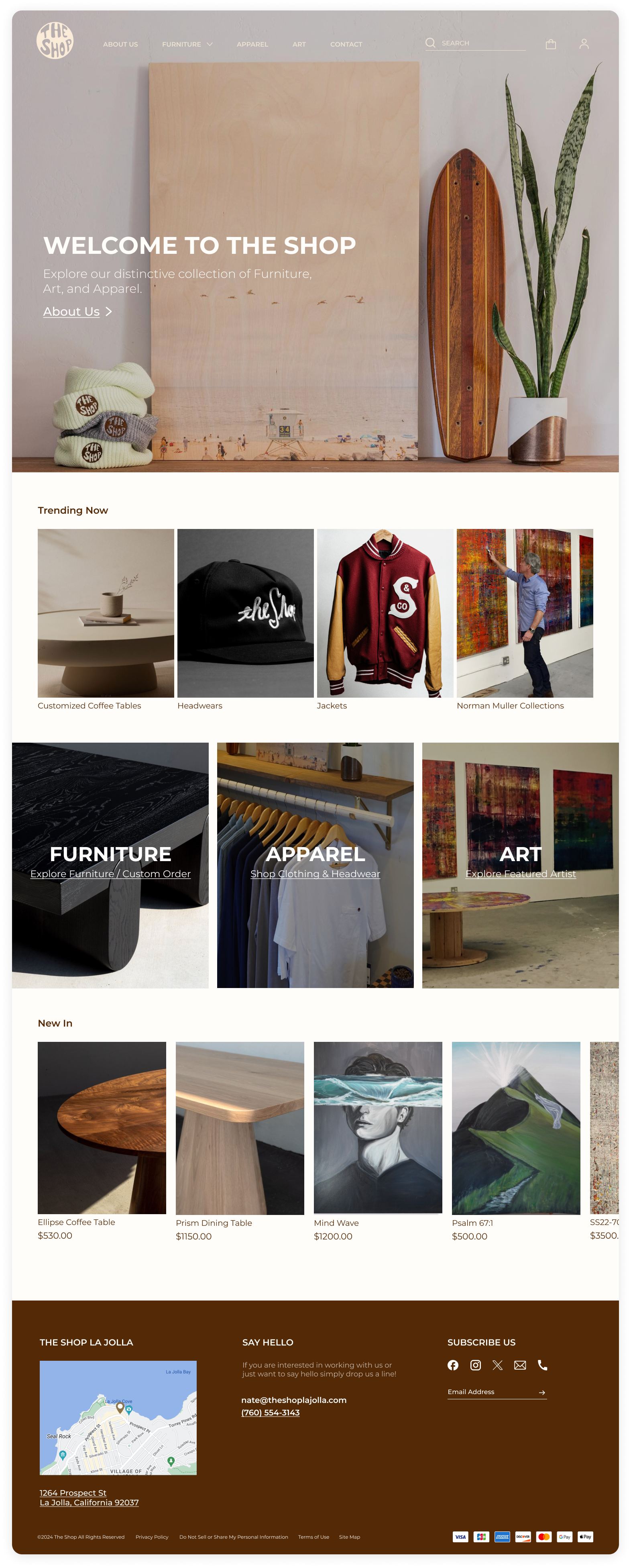
The new design offers a more comprehensive introduction to The Shop. It includes a welcoming image leading to the "About Us" page, displays trending items, and highlights three primary categories. Additionally, it features a section for new items, providing customers with a clearer overview of what the shop has to offer.
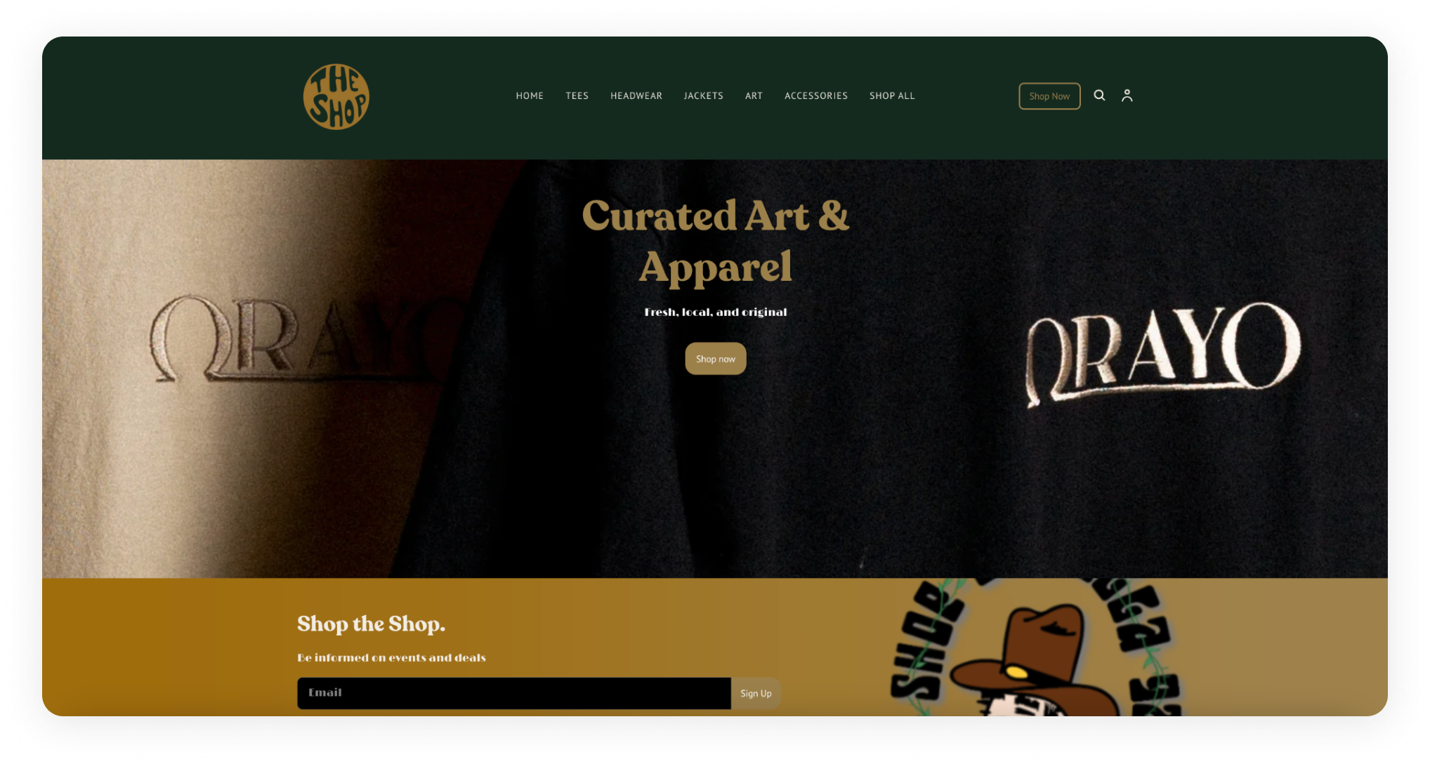
Original Homepage Issues
Does not effectively communicate the shop's offerings. It only mention curated art and apparel, with a background of the text “Orayo”.
Navigation Bar
In the original website, the navigation bar had an unclear information hierarchy, resulting in a disorganized user experience. With the addition of new pages, we redesigned the nav bar for clearer organization, prioritizing primary information like "About Us," "Furniture," "Apparel," "Art," and "Contact Us." Secondary information is accessible through dropdown menus under the relevant main categories. We also added a hover effect to enhance usability, making interactions more intuitive and engaging.
Current Nav Bar
New Nav Bar
Search Bar
Instead of a traditional plain search bar, we enhanced it with images and recommendations tailored to user interests.
Account
The account page utilizes a single-page design, enhancing user convenience by providing quick access to order history and personal details in one organized location. This approach allows users to easily navigate their profile, update information, and manage settings without the need to navigate through multiple pages.
About Us
After consulting with our client, we agreed to add an "About Us" page to enhance the customer experience by sharing the founder's story and the vision behind The Shop. This addition aims to deepen the connection between the brand and its customers, fostering greater engagement and loyalty by highlighting the shop's origins, values, and aspirations.
User Testing: Mobile Furniture Plage
Users stated that the placement and wording were confusing, and it was hard to distinguish between the custom order option and the premade options. Thus, we improved the layout by separating these two major categories with a new product display.
Furniture
Responding to our client's request, we added a new section to the website comprising two parts: a furniture catalog displaying handcrafted items for purchase, and a custom order section where customers can personalize furniture and request quotes via an online form.
Furniture Catalog
We organized our client's furniture into three distinct categories—coffee tables, side tables, and dining tables—into subpages for clearer navigation and ease of use.
Custom Furniture Order
After researching and brainstorming user flow, we developed a simple form-based process for obtaining quotes to improve accessibility and efficiency.
Art
The art section is divided into two main pages: "Featured Artist" and "Artwork Catalog." This structure allows customers to delve into the narrative of the featured artist, gaining insights into their creative journey and the inspiration behind their artwork.
Featured Artist
Artwork Catalog
Apparel
The apparel section of the website is organized into user-friendly categories, allowing for easy navigation and tailored shopping according to specific preferences and needs.
Apparel Details
When a user selects a product, they are taken to a detailed product page, which offers extensive information about the item, including images, descriptions, available sizes, color options, and pricing.
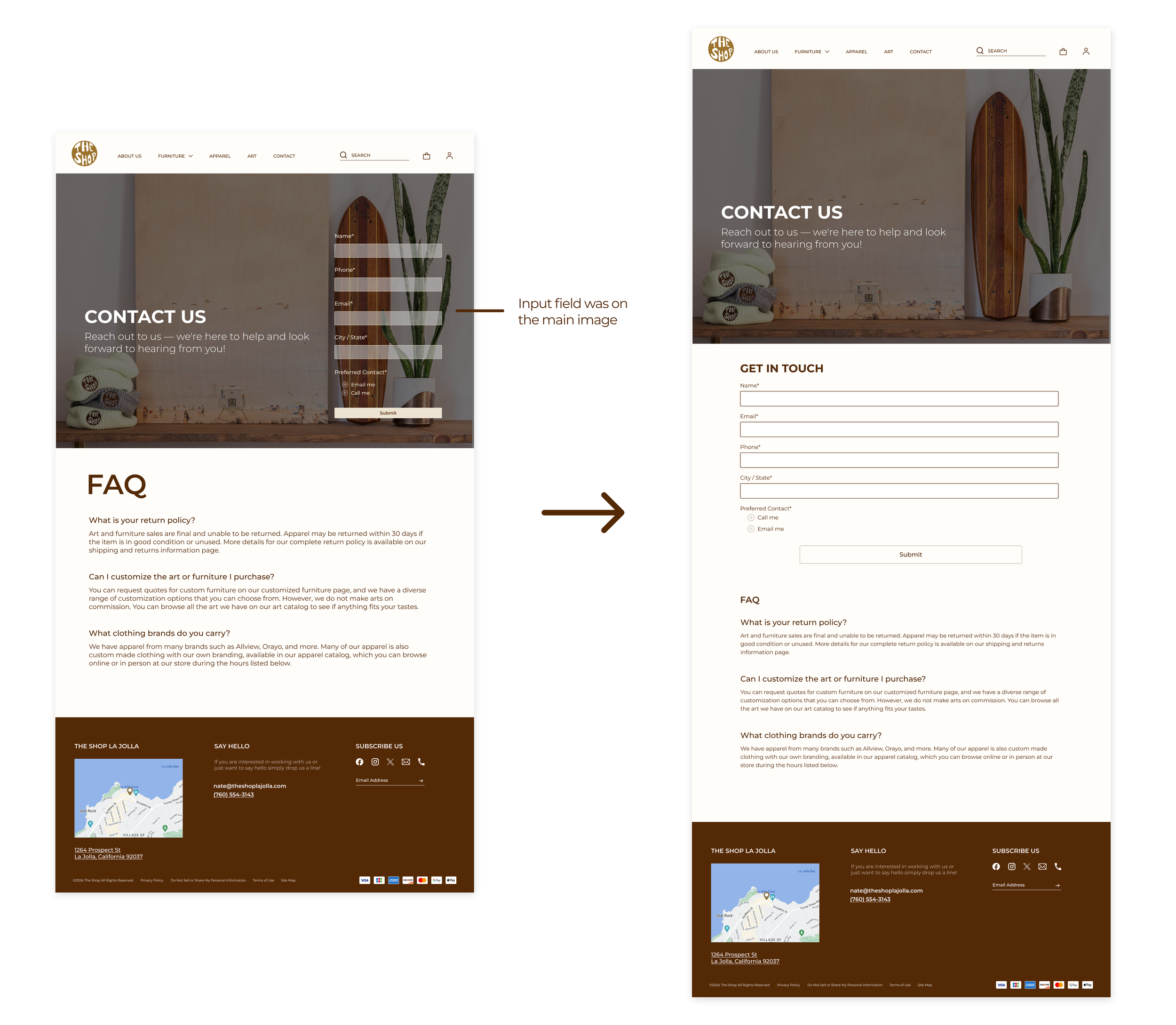
Contact Us: User Testing Mobile Screens
Users noted that the placement of the input field on the image was awkward. To enhance clarity, we moved the input field to its own dedicated section, separate from the main image.
Contact Us Page
The new contact page enhances the website by providing a convenient platform for customers to connect with the owner. It includes a form for submitting inquiries, feedback, or requests, and a Frequently Asked Questions (FAQ) section that addresses common queries. This setup encourages users to interact with the site, offering a straightforward method for communication that eliminates the need for emails or phone calls.
Final Takeaways
We received very positive feedback from our client, as well as from our professor and teaching assistants. Our TA stated that the branding is strong and was thoughtful/ Our client expressed a high level of satisfaction with the proposed designs.
If I had more time…
I would aim to conduct further user testing with both potential and current customers to gather more comprehensive insights into their preferences and feedback. Additionally, I would explore the possibility of incorporating more advanced features into the platform, such as virtual reality previews for furniture, to enhance the user experience by offering a more immersive and interactive way to view products before making a purchase decision.
What I’ve Learned…
I learned that effective communication with clients is crucial for aligning visions and ensuring that project goals are met. The importance of adaptability and the willingness to embrace feedback were underscored, emphasizing their roles in refining project outcomes. Additionally, the importance of conducting user research and testing and incorporating user feedback. These elements are vital for creating user-centered designs that meet the needs and expectations of the target audience.
